Project Overview
A redesign of Riot Fest’s landing page and ticket funnel for both mobile and web interfaces.
Problem Statement
The old Riot Fest design condenses all ticket tier information into a visually clunky table with little live text. The landing page is full of unnecessary information and there are few visual aids to help discern the difference experiences between ticket tiers.
Role
UX design school project
Timeframe
1 month
Comparative Analysis
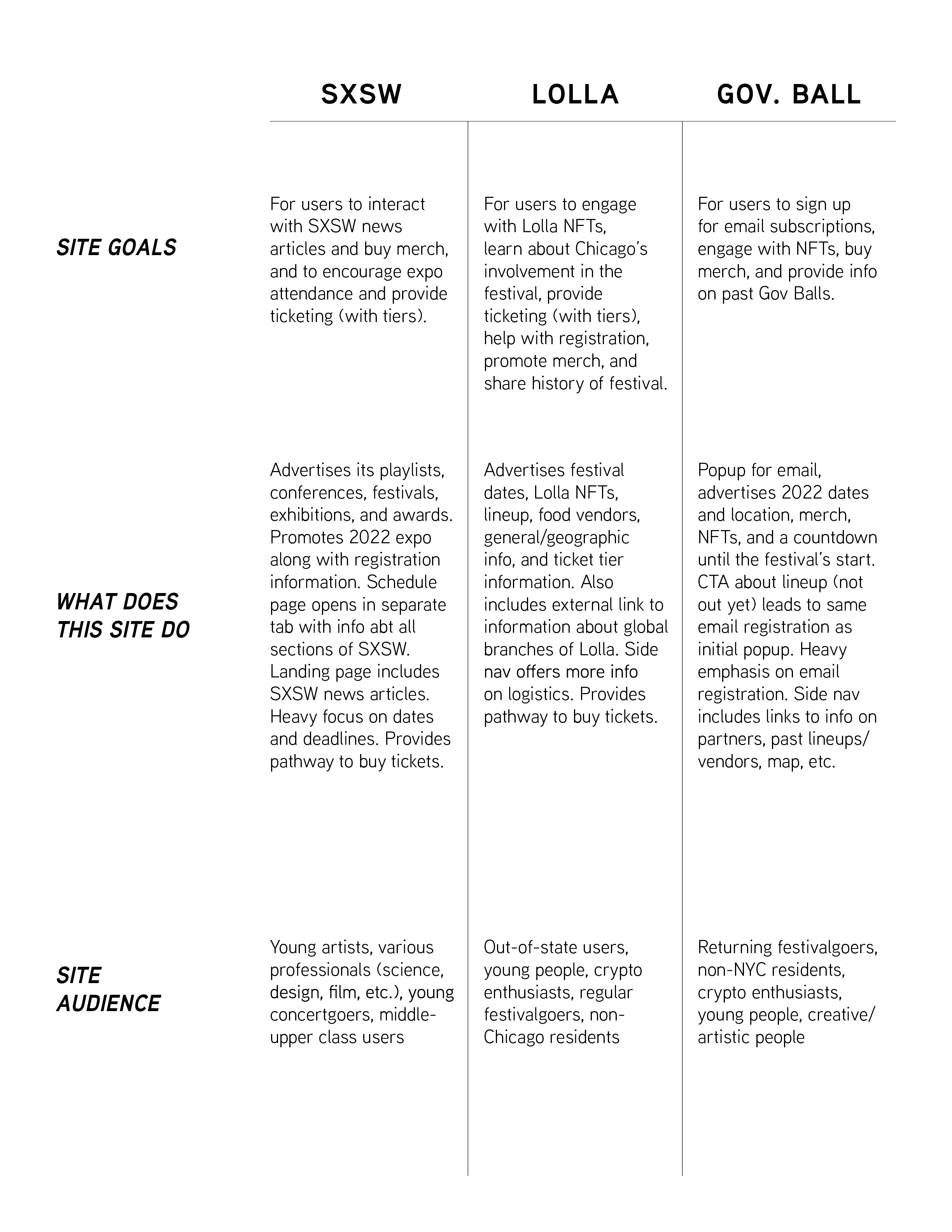
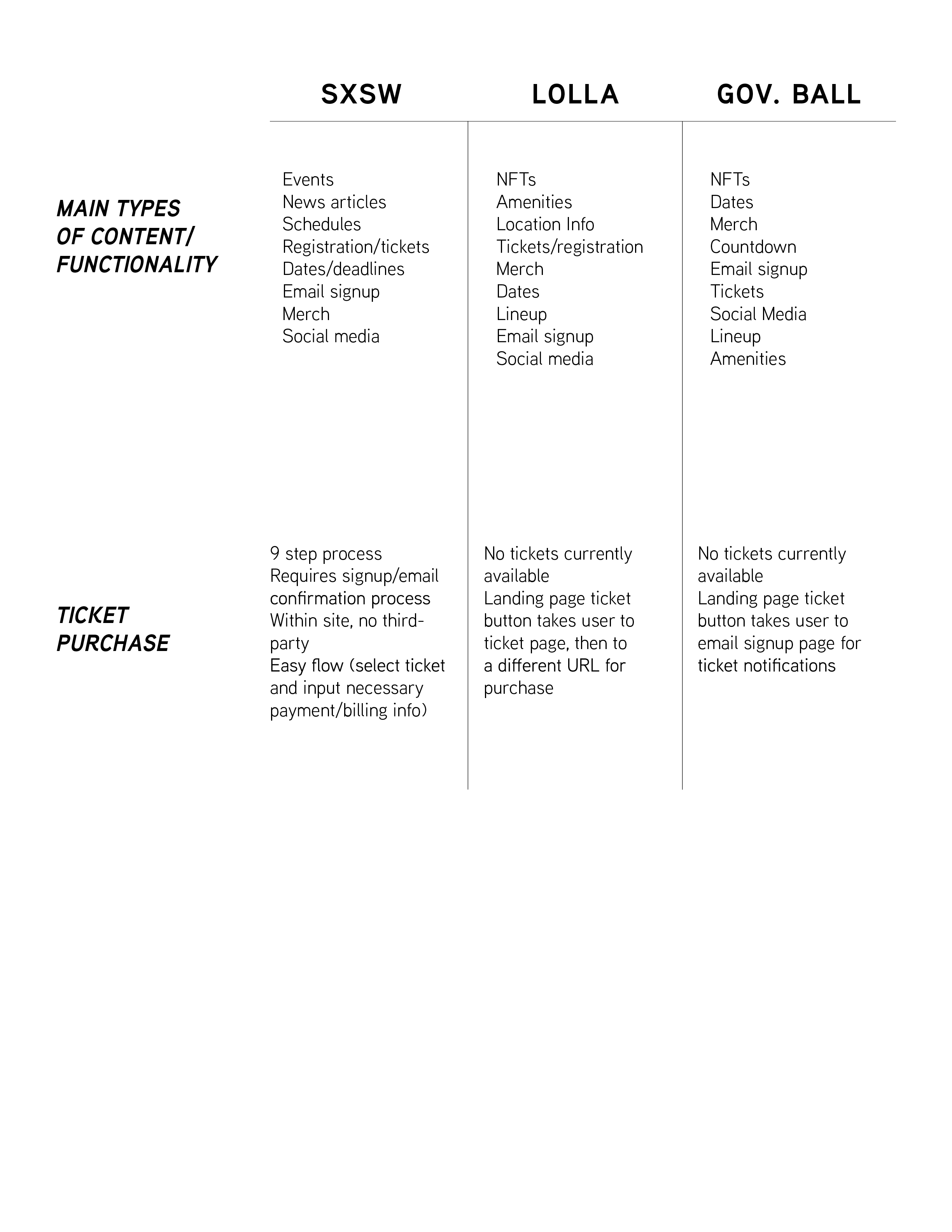
We researched three prominent musical festival sites to see their site goals, audience, functionalities, and their ticket buying process. We looked at the sites for SXSW, Lollapalooza, and the Gov Ball.
We also did a visual analysis of each site’s landing page, noting image usage, interactivity, and type choices among other features. This further analysis helped us develop pain points for the old Riot Fest site design.


Pain Points
Ticket table is visually confusing, with no live text
Redundant “Purchase Ticket Buttons”
Few images of the festival/no hero image
Poor information hierarchy
Personas
User Task Flow
We developed a straightforward ticket funnel task flow that eliminates the unnecessary steps, third party redirections, and unhelpful links of the old design.
Wireframes
Style Guide/Branding
Final Prototypes
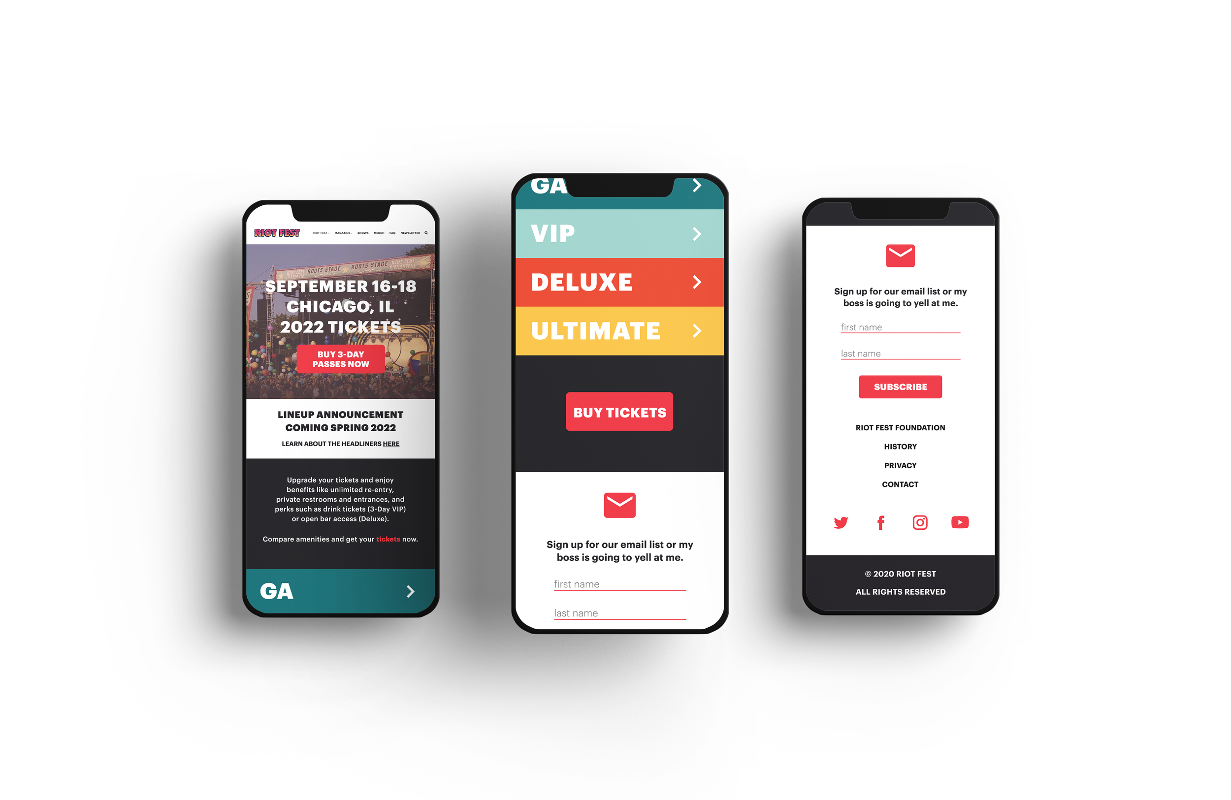
The landing page adds a hero image and includes only necessary information. The old ticket table is transformed into dropdowns (on mobile interface).
The dropdowns include each tier’s amenities and images of what each tier offers.
The ticket purchasing process is condensed to a single screen with each tier’s correlating colors.
The final screen of the process is a quick checkout with an option to pay two ways.
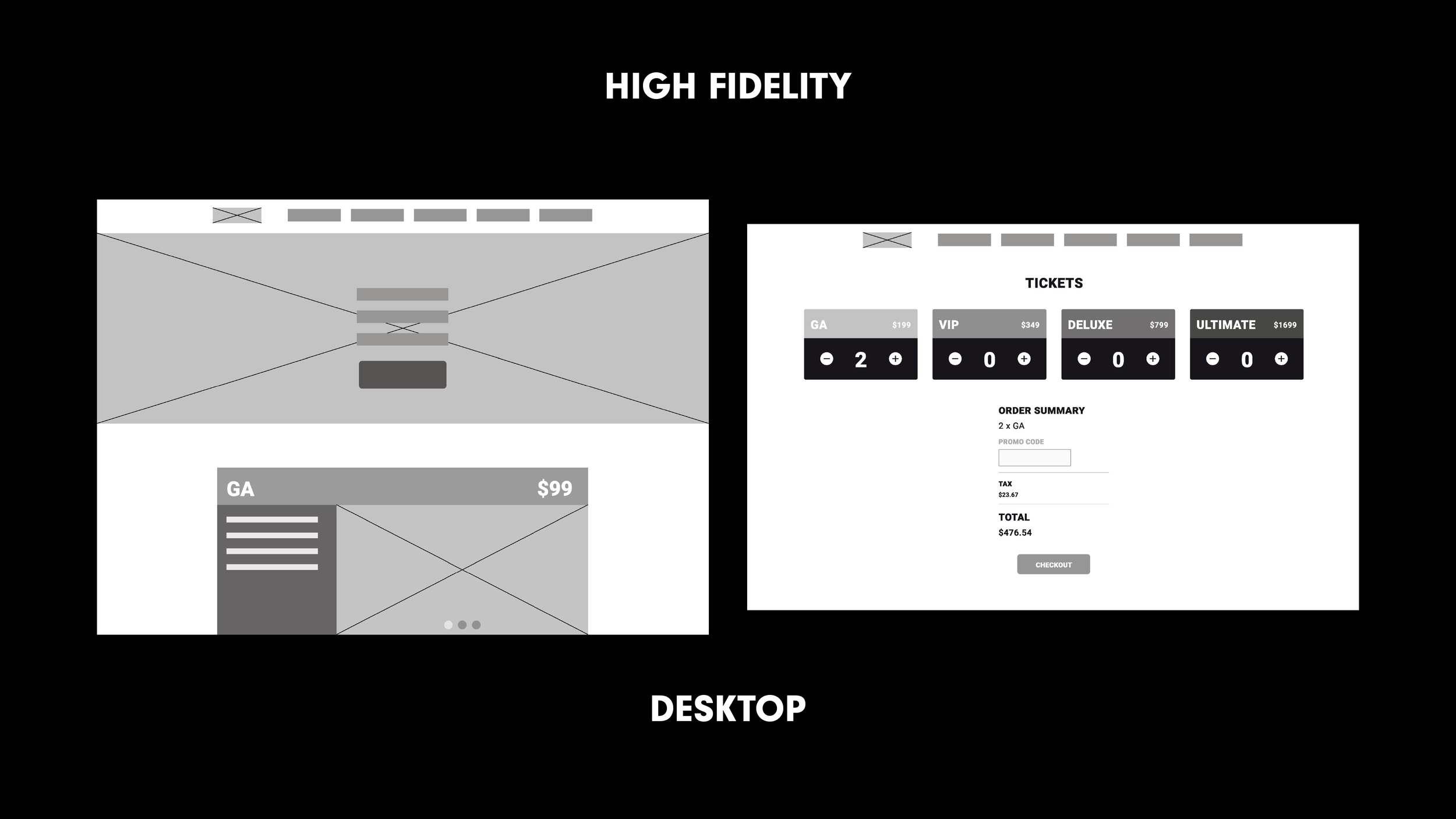
The web interface changes the mobile dropdowns to cards, with amenities on the left and a carousel of images for visual aids.
The ticket process is simple and only requires two steps.
